Grid
A grid is the fundamental framework for all visual elements, typography, and layout. The grid is constructed from a baseline grid, columns, gutters, and margins.
We follow the rules of 8’s as a guide when we design our experiences. This enables us to maintain consistant spacing thorughout our experience.
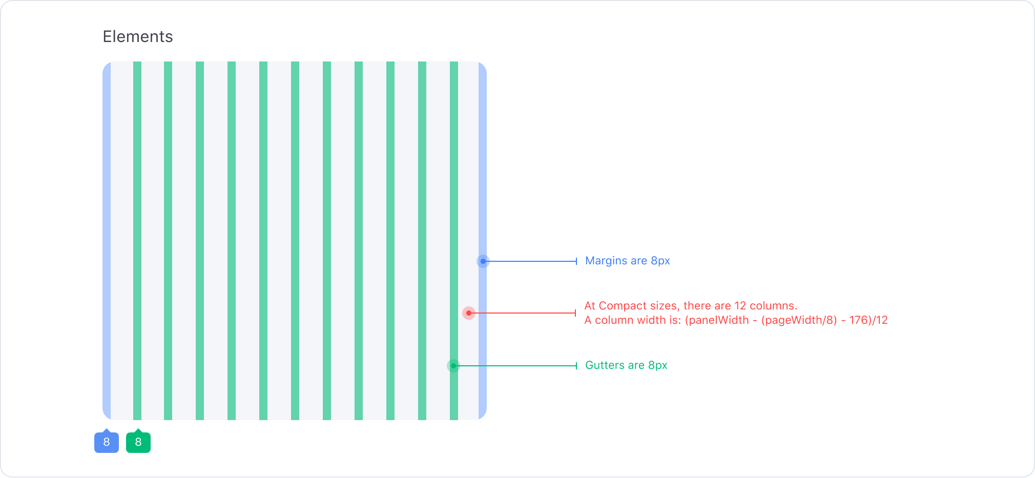
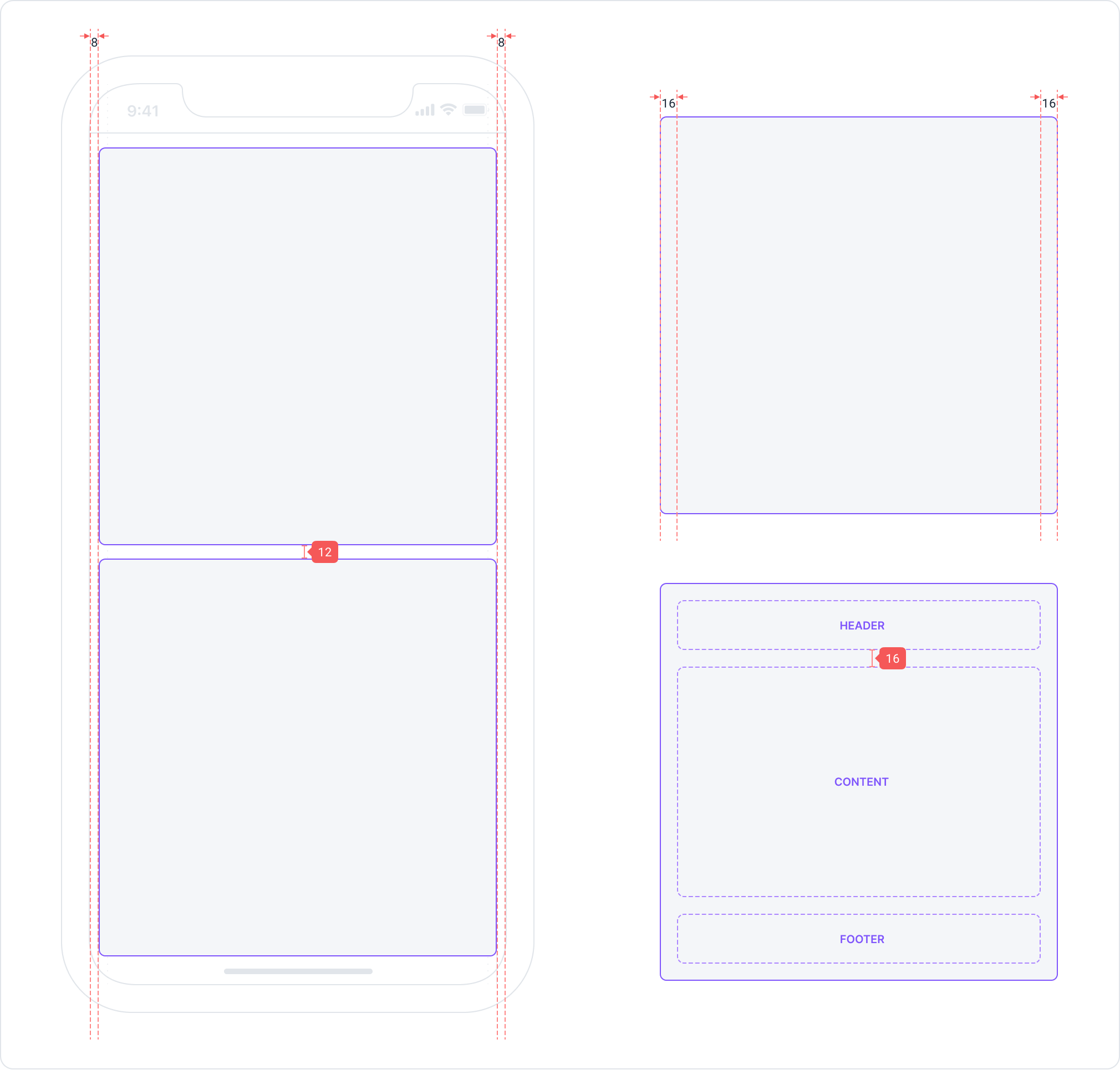
Compact Grid (0-767)
The Compact Grid is 12 columns and supports mobile web and app breakpoints
Measurements
Even Numbers
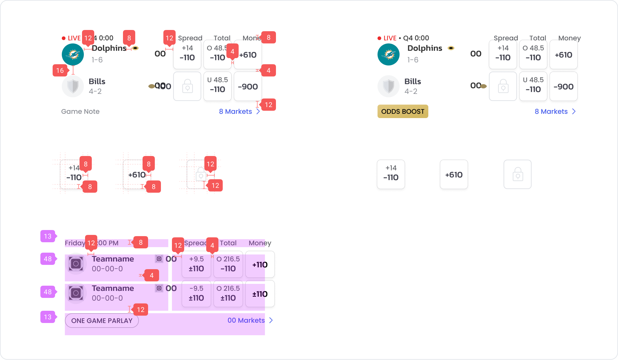
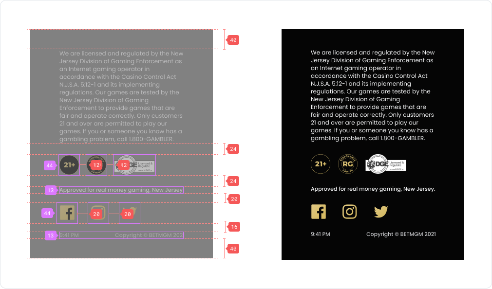
Spacing
Our spacing uses the rule of 8’s to maintain consistency throughout the app.
| Example | Token | px | rem |
|---|---|---|---|
| $Spacer-tiny | 2px | 0.125 | |
| $Spacer-xs | 4px | 0.25 | |
| $Spacer-s | 8px | 0.5 | |
| $Spacer-m | 12px | 0.75 | |
| $Spacer | 16px | 1 | |
| $Spacer-l | 20px | 1.25 | |
| $Spacer-xl | 24px | 1.5 | |
| $Spacer-2xl | 28px | 1.75 | |
| $Spacer-3xl | 32px | 2 | |
| $Spacer-4xl | 36px | 2.25 | |
| $Spacer-5xl | 40px | 2.5 | |
| $Spacer-6xl | 48px | 3 | |
| $Spacer-7xl | 56px | 3.5 | |
| $Spacer-8xl | 64px | 4 | |
| $Spacer-9xl | 72px | 4.5 | |
| $Spacer-10xl | 80px | 5 |
Example
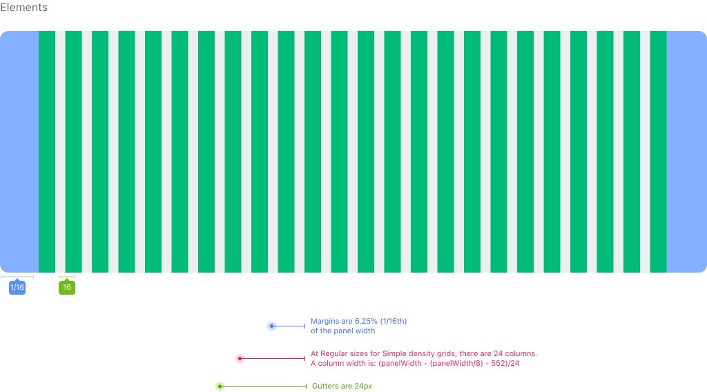
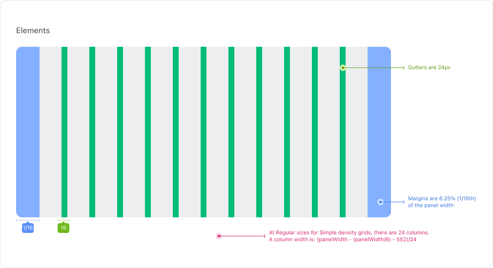
Regular Grid (768-1600)
The Regular Grid is 24 columns and is used on tablet size breakpoints
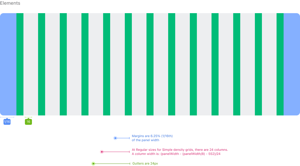
Regular Grid (768-1600)
The Regular Grid is 12 columns and is used for Web Desktop and Kiosk Breakpoints.
Detailed Grid (768-1600)
The Detailed Grid is 24 columns that follows the same measurements of the 12 column grid but gives designers more flexibility to design with.