Actions
Toggles • Radio Buttons • Checkboxes
Usage
Toggles, radio buttons, and checkboxes are all used to change the state of an
interaction. They are typically associated with form inputs and list views.
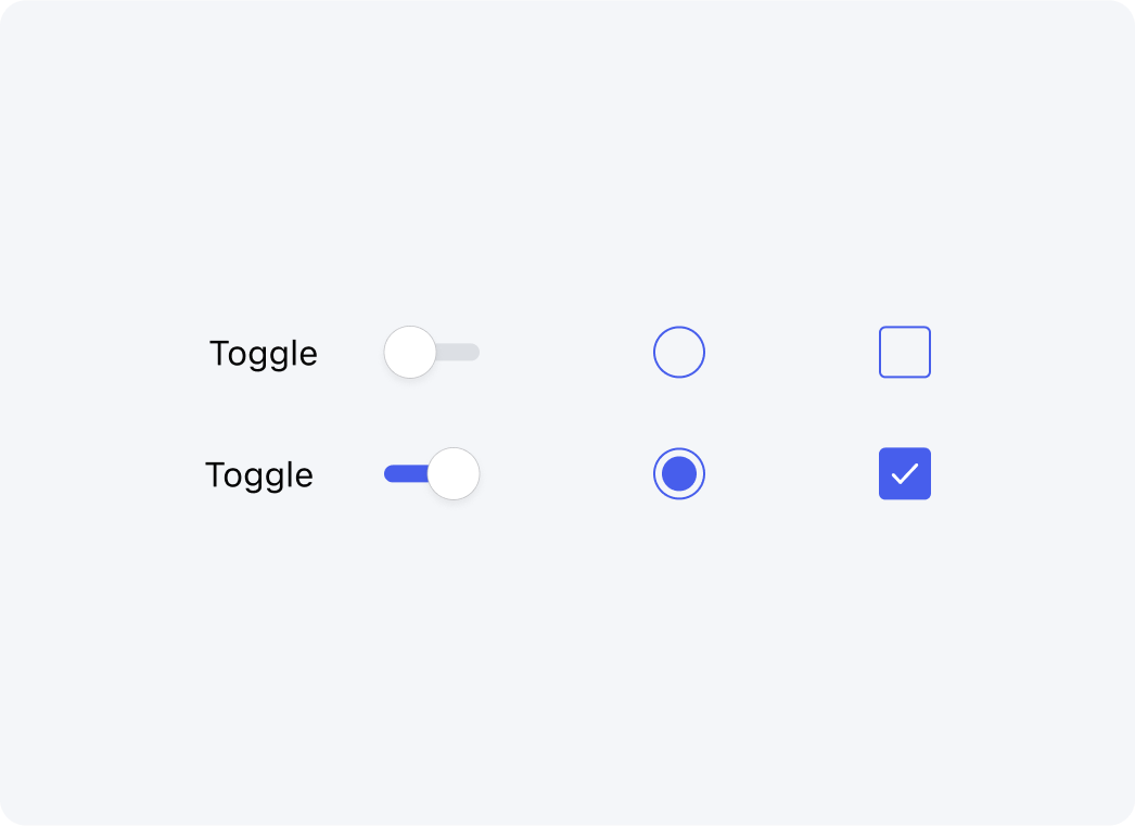
Toggles
Toggles alternate states between two options.
Radio Buttons
Radio buttons allow for a single option to be selected.
Toggles
Checkboxes allow for the selection of one or more options from a list.
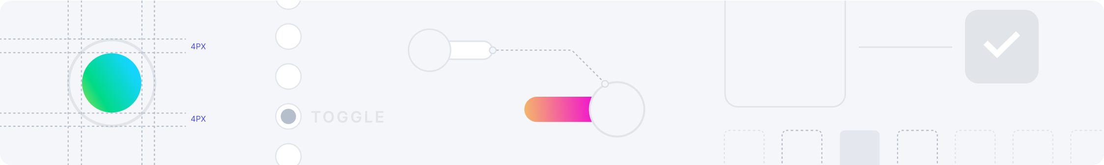
Anatomy
TBD
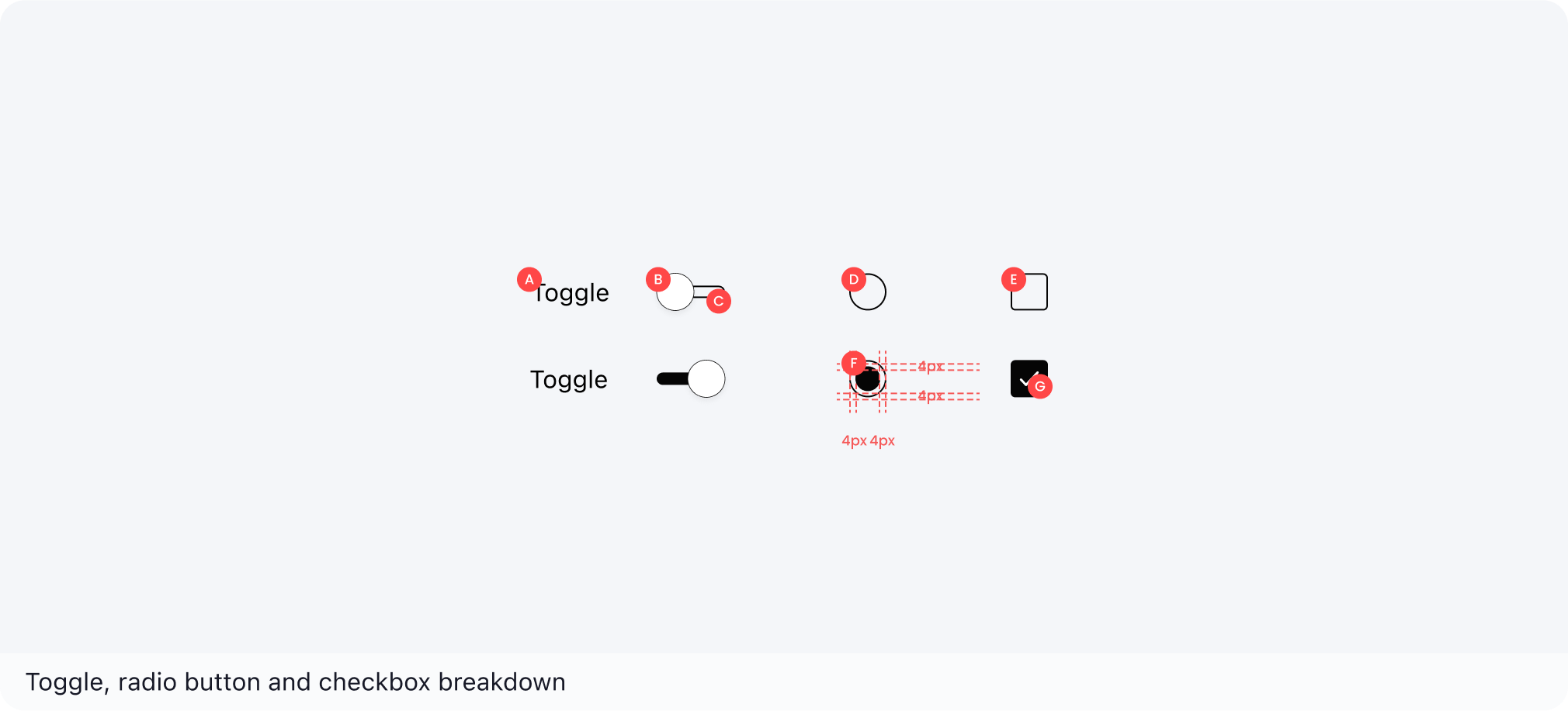
| A | Body | E | Container |
| B | Handle | F | Dot |
| C | Track | G | Icon |
| D | Container |
Variants
N/A
Toggle
| Component | State | Notes |
|---|---|---|
Off  |
Default | N/A |
On  |
Active | N/A |
Radio Button
| Component | State | Notes |
|---|---|---|
 |
Default | N/A |
 |
Selected | N/A |
| Keep placed bets in bet slip |
Default w/ text | N/A |
| Keep placed bets in bet slip |
Selected w/ text | N/A |
Checkboxes
| Component | State | Notes |
|---|---|---|
 |
Default | N/A |
 |
Selected | N/A |
| Keep placed bets in bet slip |
Default w/ text | N/A |
| Keep placed bets in bet slip |
Selected w/ text | N/A |
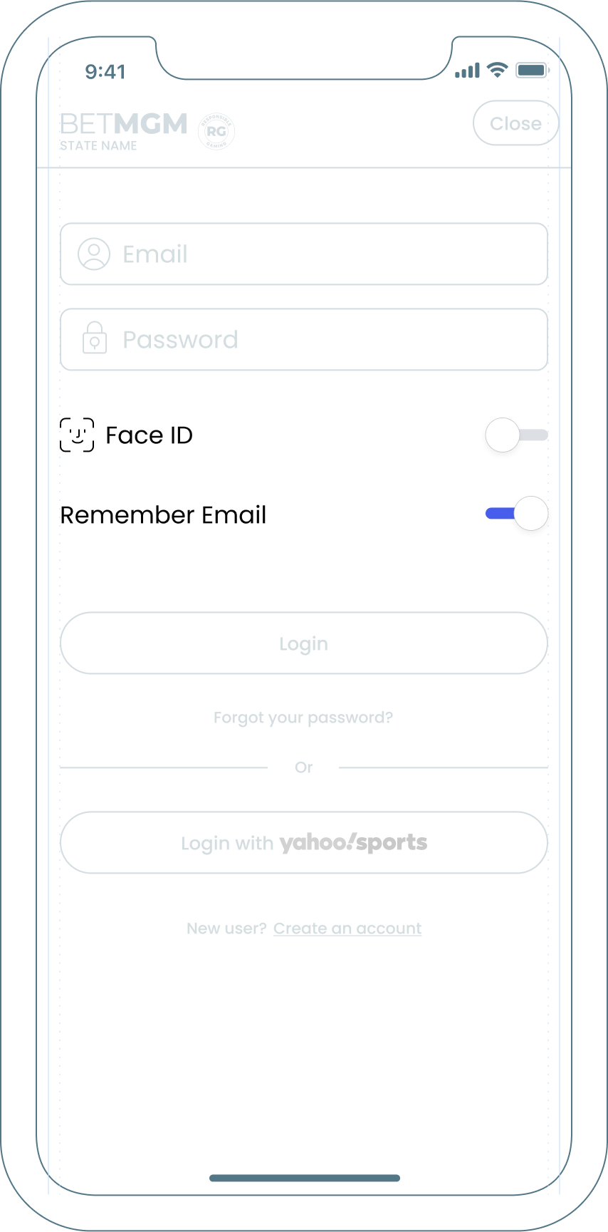
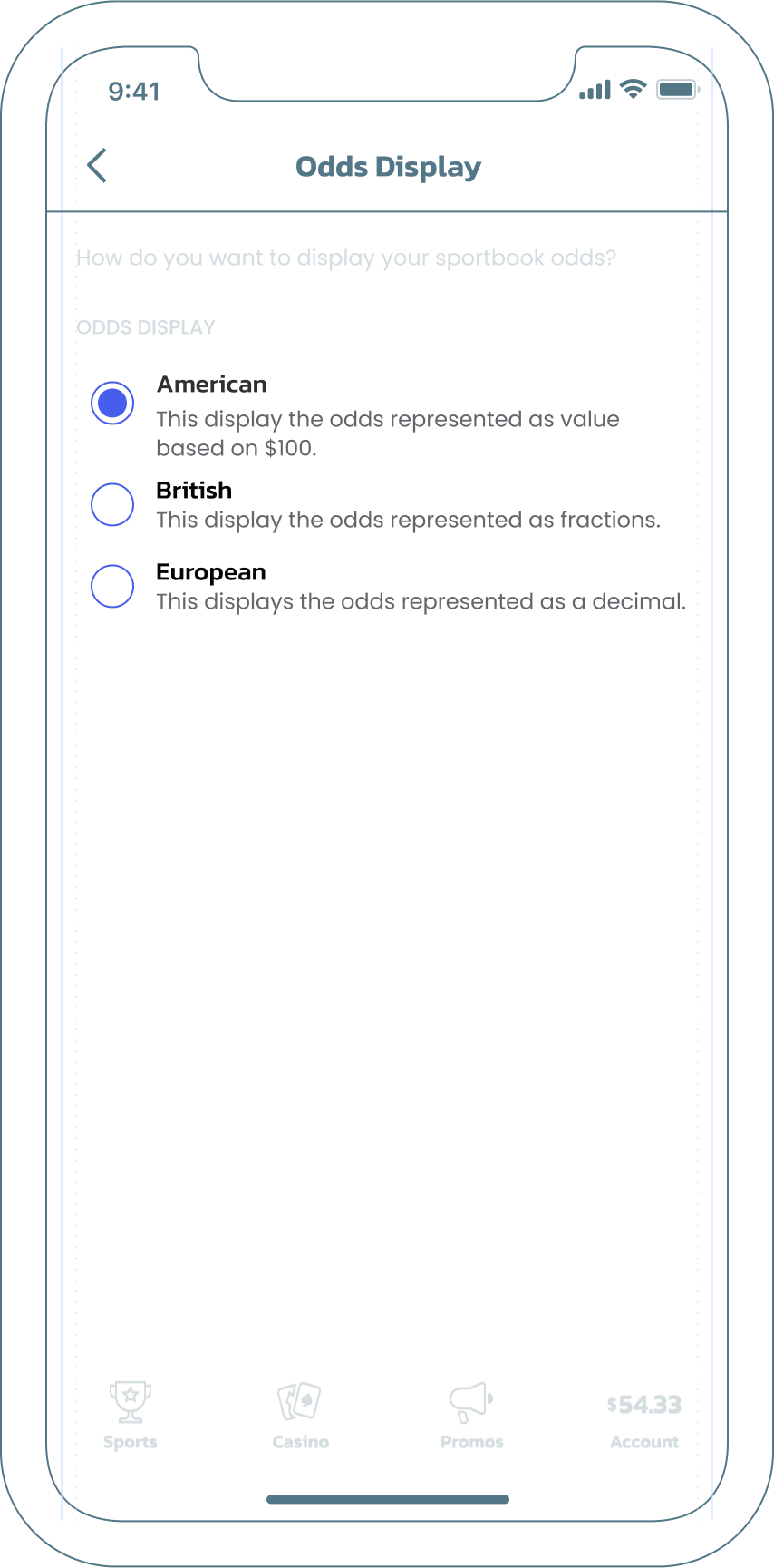
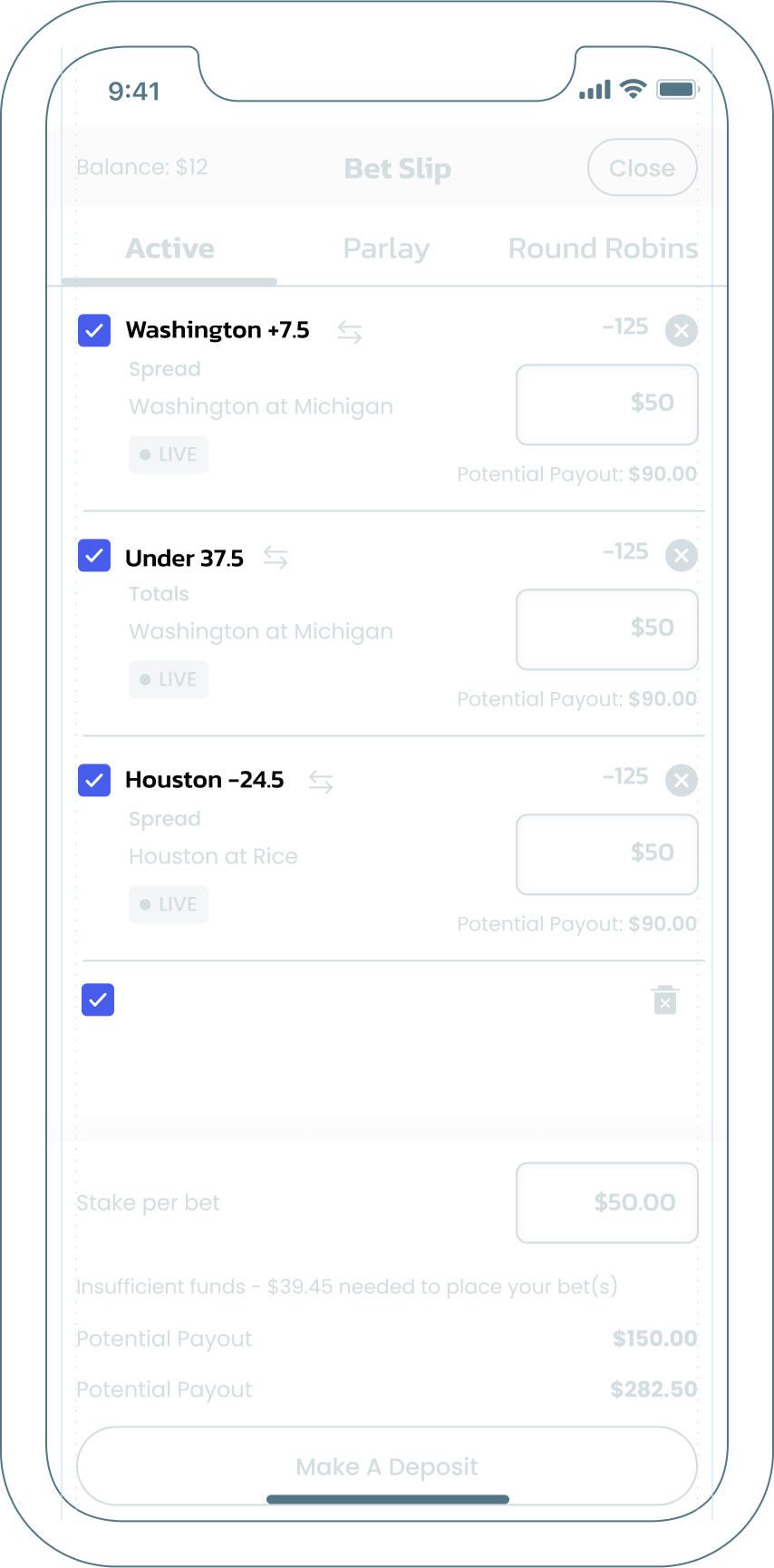
Examples
Here are a few examples in context.