
Buttons
What Changed?
Pressed states: 12% white opacity (darkmode ), % blue (lightmode)
Component Description
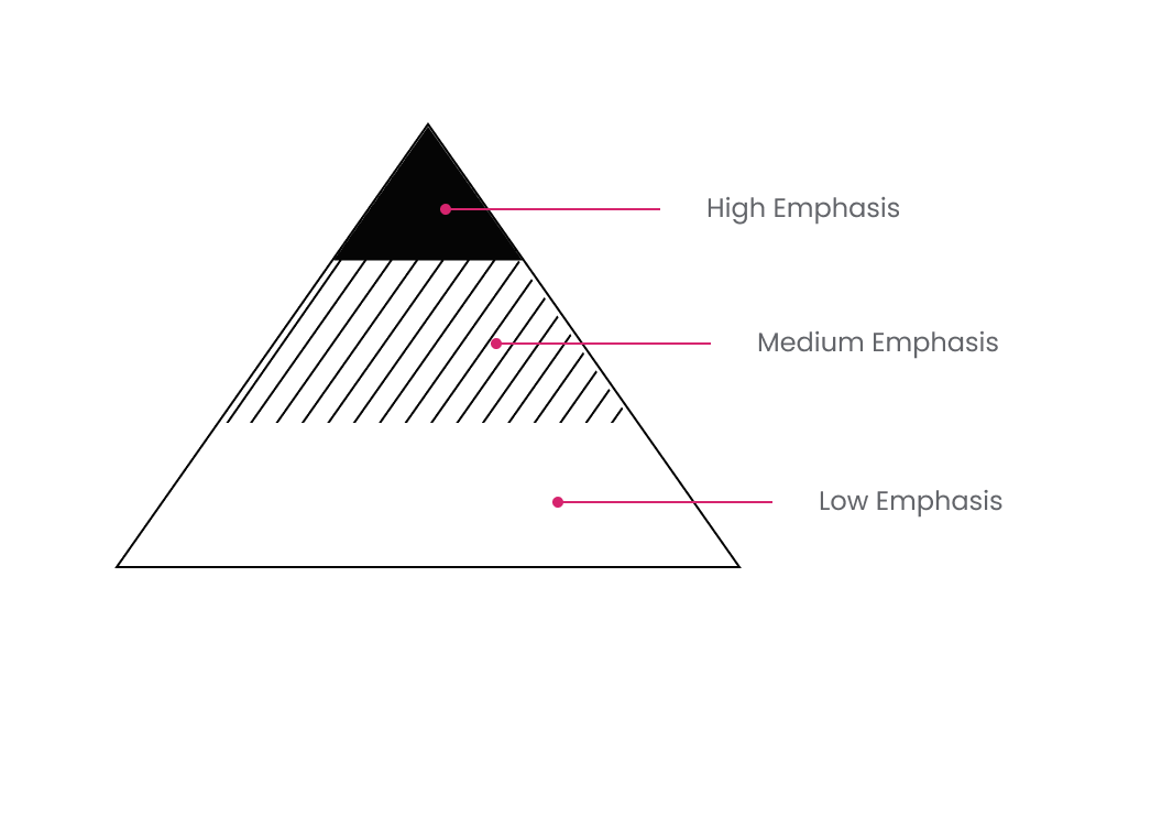
Buttons enable actions and allow users to navigate throughout the product. Buttons are categorized into three groups in order to differentiate levels of importance.
Primary
The primary button is to be used for high emphasis interactions such as transactional scenarios. There should never be more than one per page.
Secondary
The secondary button highlights medium emphasis actions. It is more commonly used than the primary button, but should never clutter a page.
Tertiary
The tertiary button highlights low emphasis actions. It is often used as an alternative to primary or secondary actions.
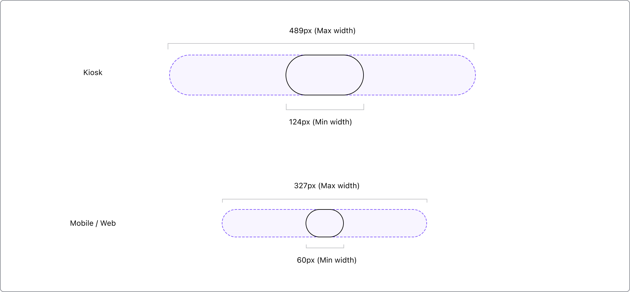
Anatomy
Buttons should have a minimum touchpoint of 44 pixels to support accessibility requirements.

| Mobile | Web | Kiosk | |
|---|---|---|---|
| A | 1px border | 1px border | 1px border |
| B | Footnote Caption 1 |
Footnote Caption 1 |
Footnote Caption 1 |
| C | 12px Icons 16px Icons |
12px Icons 16px Icons |
24px Icons |
Behavior
To meet accessibility standards, all buttons have a touchpoint of 44px.
Best Practices
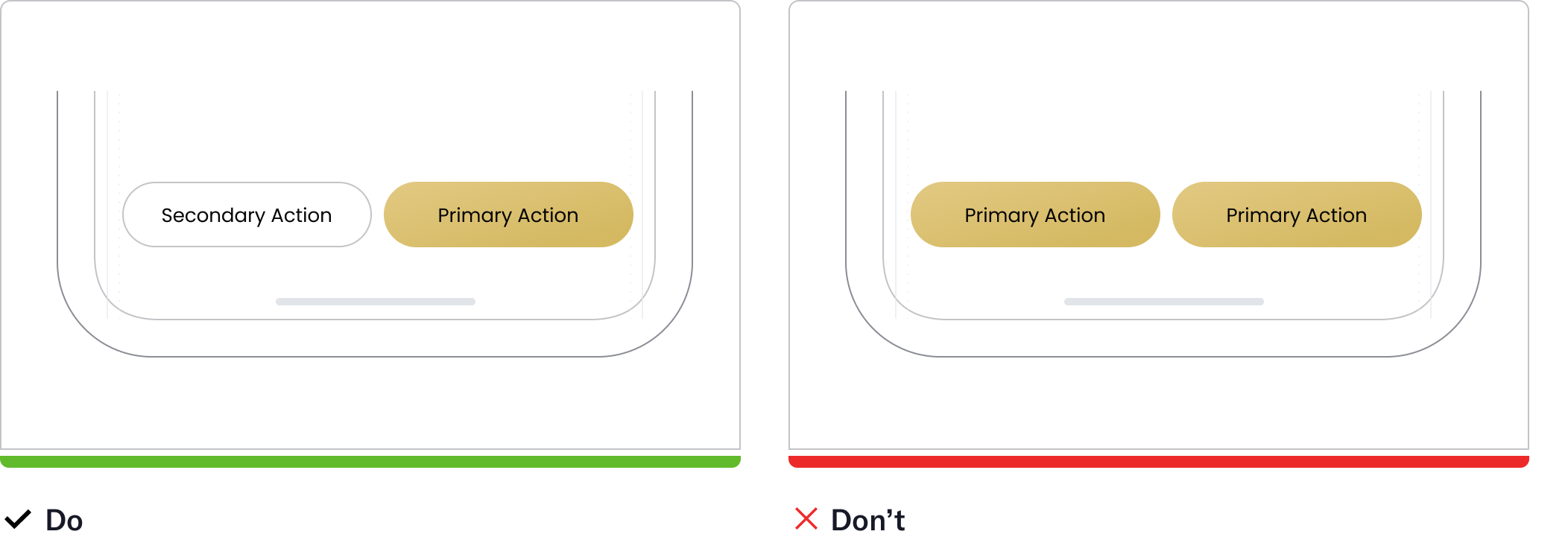
The tertiary button highlights low emphasis actions. It is often used as an alternative to primary or secondary actions.
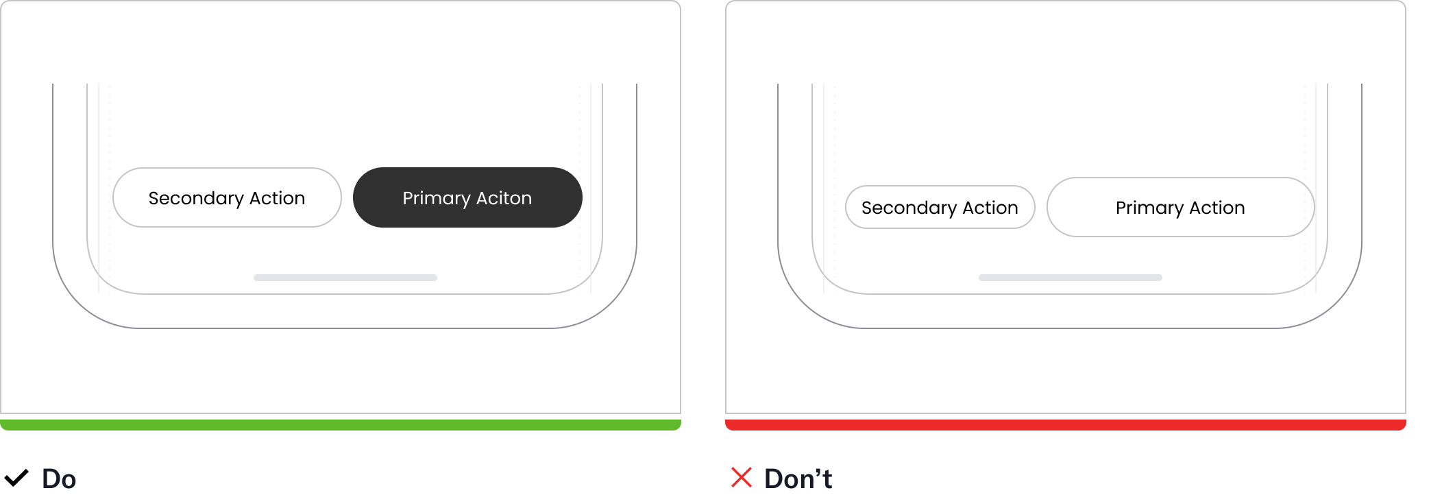
The tertiary button highlights low emphasis actions. It is often used as an alternative to primary or secondary actions.
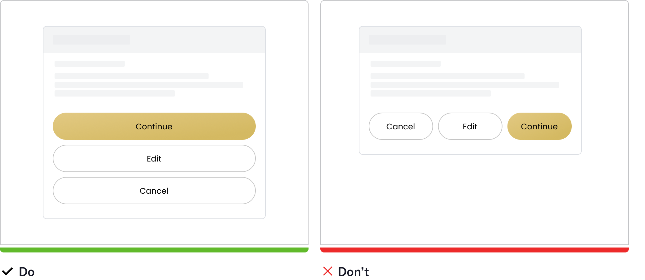
The tertiary button highlights low emphasis actions. It is often used as an alternative to primary or secondary actions.
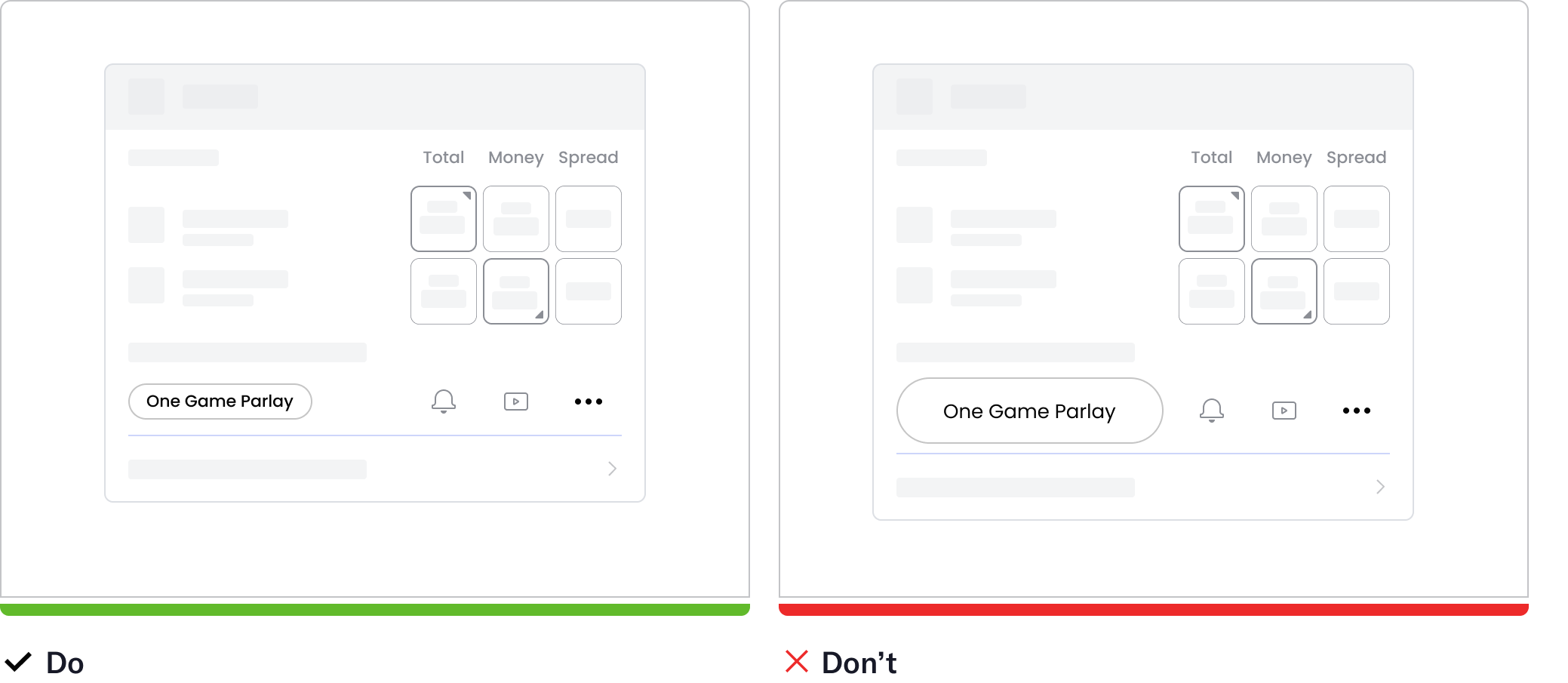
The tertiary button highlights low emphasis actions. It is often used as an alternative to primary or secondary actions.
Behavior
To meet accessibility standards, all buttons have a touchpoint of 44px.
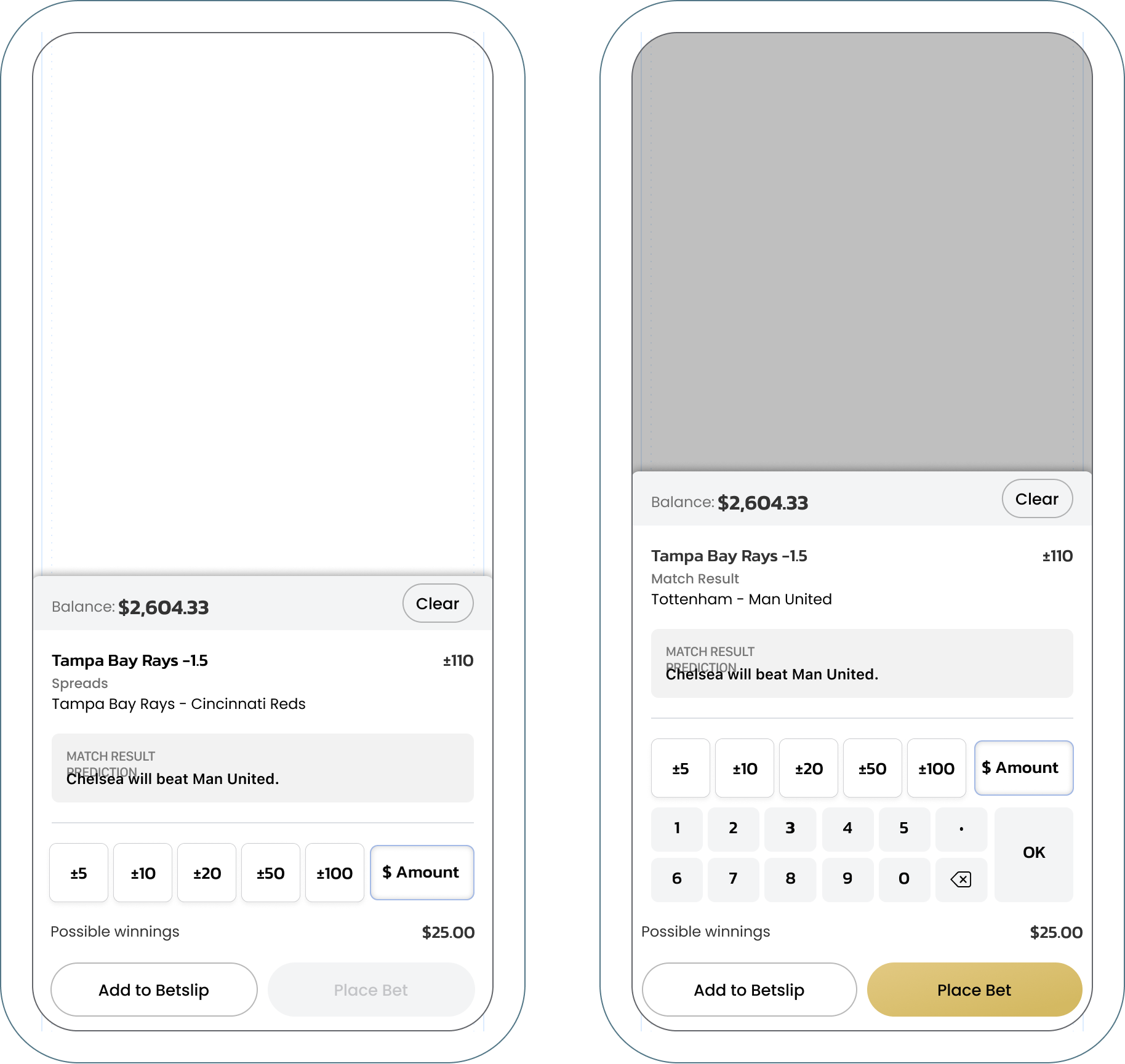
Ghost Button (Text Only)
To meet accessibility standards, all buttons have a touchpoint of 44px.
Show more
Default
Show more
Hover
Show more
Tap
Show more
Visited