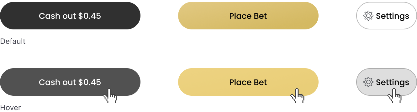
Interaction States
Below are the changes to the design system
Tap Feedback
Tap states give users feedback on the status of ongoing processes and allow the user to perceive greater speed.
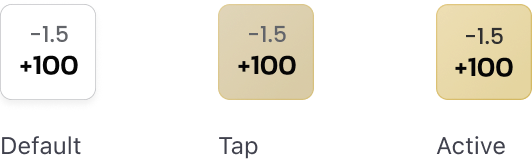
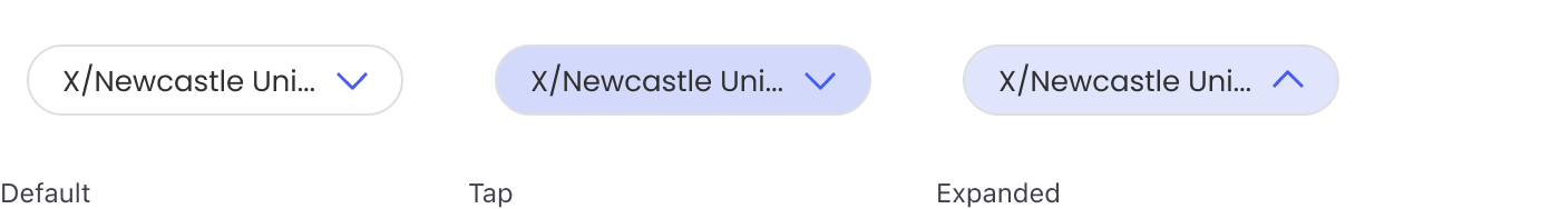
Light backgrounds
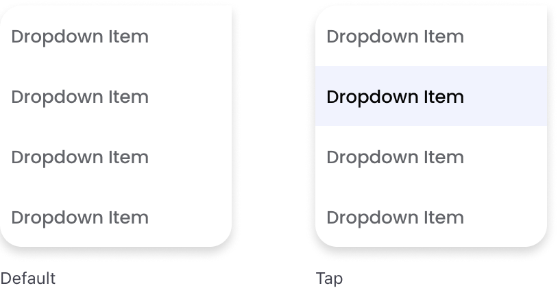
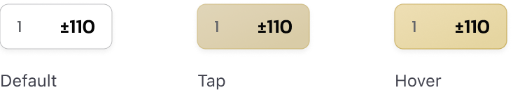
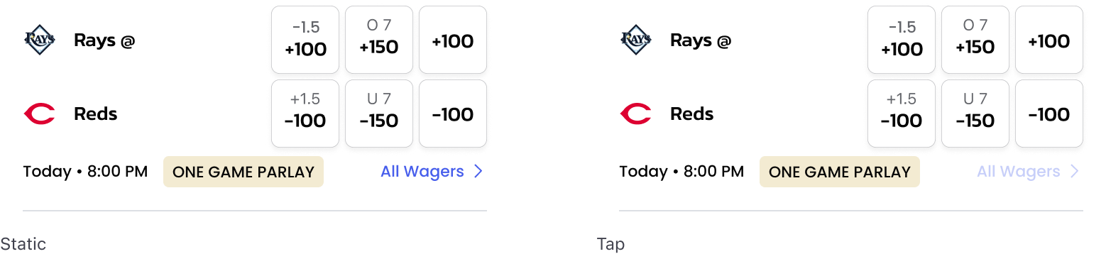
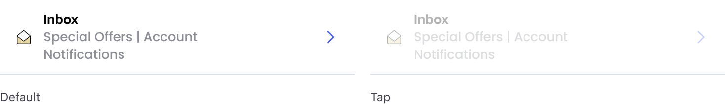
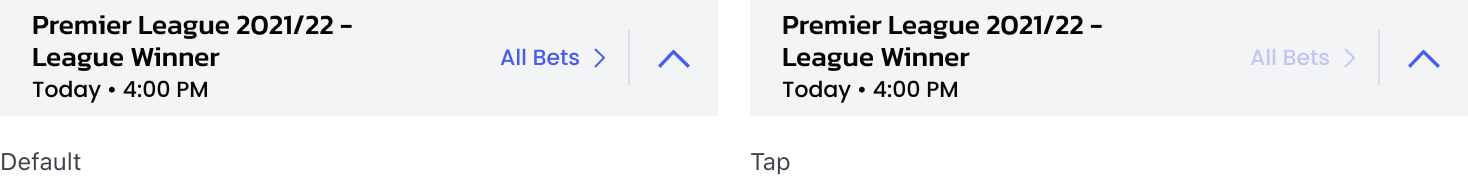
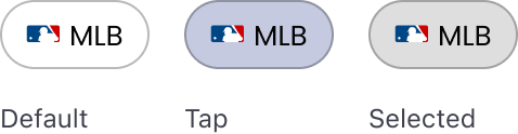
When components appear on a light background, add an 8% $action overlay to Static or Default states. If an Active or Expanded State exists, add 8% $action to the Active or Expanded state, whichever occurs first. Text Links appear at 30% opacity on tap.
Examples
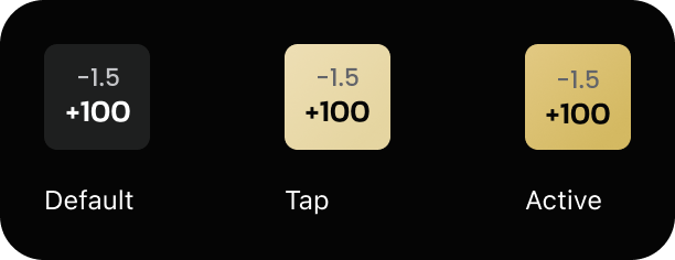
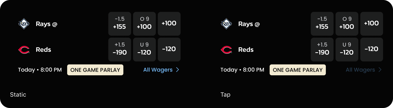
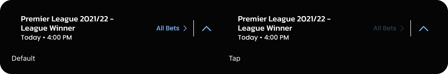
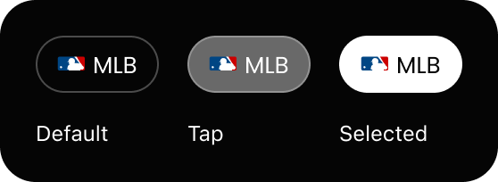
Odds Buttons
Dropdowns
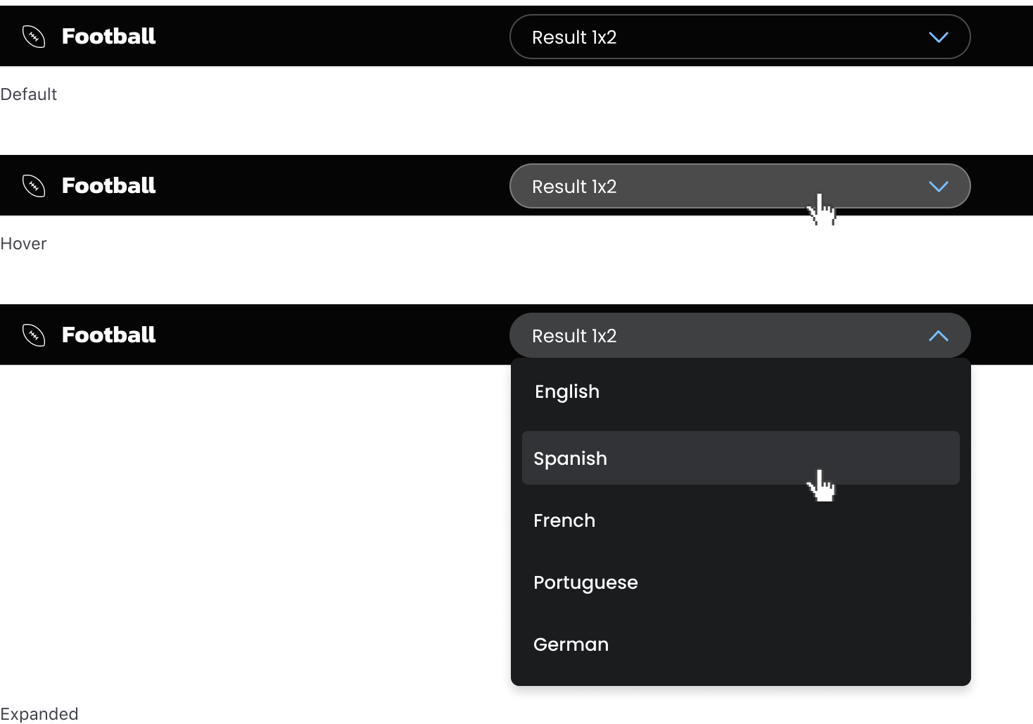
Dropdown Items
Marquee Odds Buttons
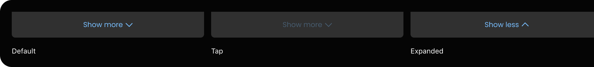
Show More Button

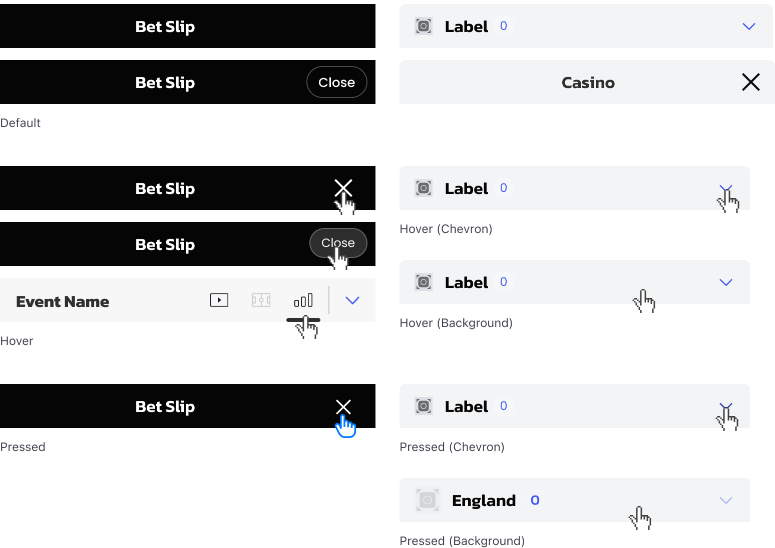
Events
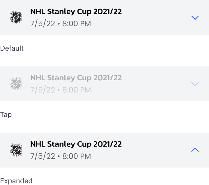
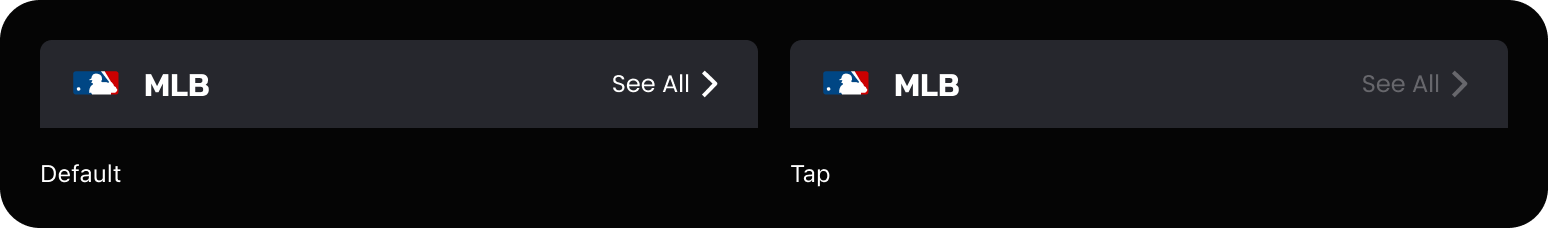
Headers
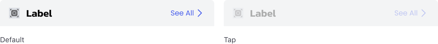
Account Menu
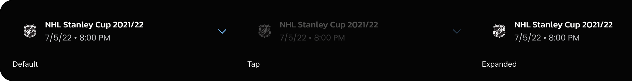
Outrights
Icons with Label
Icons with labels will decrease in opacity from 100% to 30%
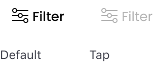
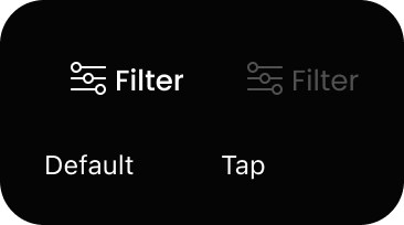
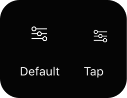
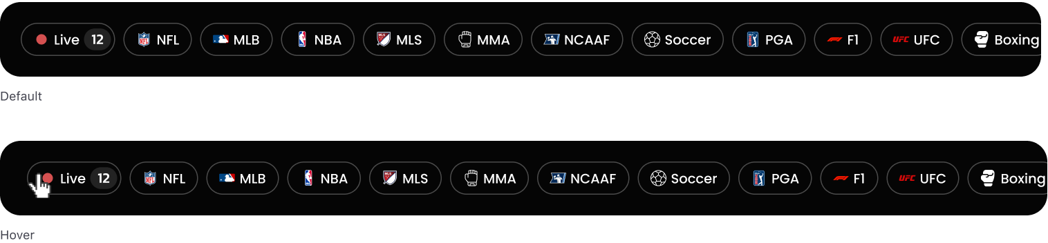
Filter
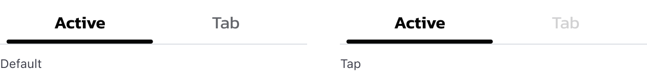
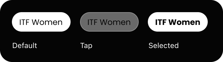
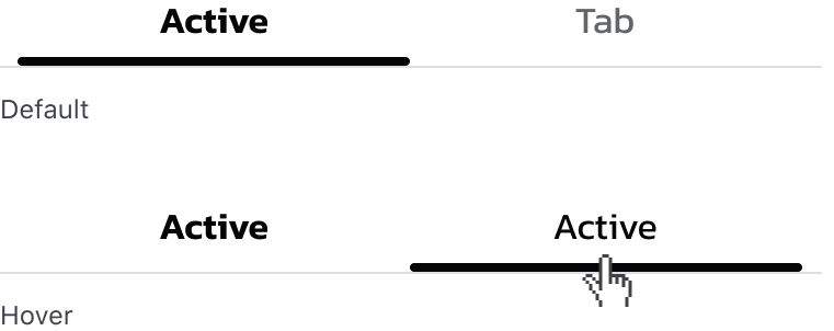
Tabs
Segmented Controller

Exceptions
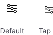
Icons
Standalone icons will reduce in size by 15%
Dark backgrounds
When components appear on a dark background, add a 40% white overlay to the Static or Default state. If an Active and/or Expanded state exists, add a 40% white overlay to the Active or Expanded state, whichever occurs first. Text Links appear at 30% opacity on tap.
Examples
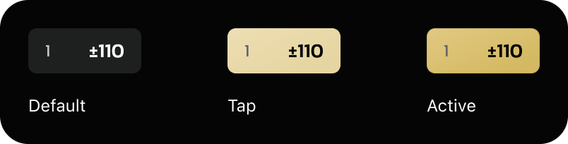
Odds Buttons
Marquee Dropdown
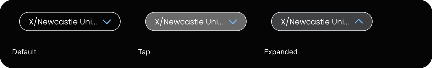
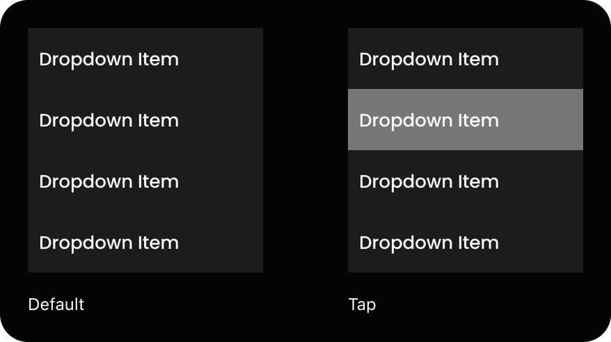
Dropdown Items
Marquee Odds Buttons
Show More
Dropdown Items
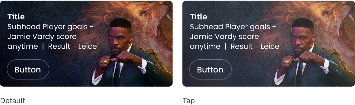
Events
Headers
Outrights
Icons with Label
Icons with labels will decrease in opacity from 100% to 30%.
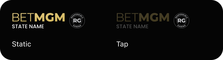
Logo
Logo will decrease in opacity from 100% to 30%.
Tabs
Tabs will decrease in opacity from 100% to 30%.
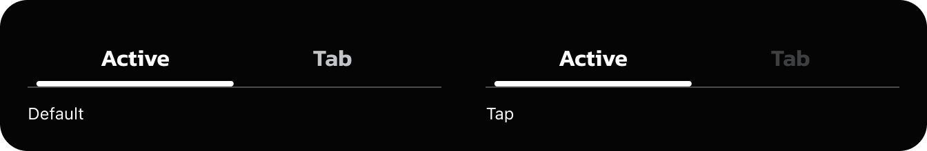
Tabs
Tabs will decrease in opacity from 100% to 30%.
Exceptions
Filter
A 40% overlay of white is added to the Default state because Selected state is 100% white.
Live: Secondary Filter
A 40% overlay of white is added and the fill removed because Default and Selected states are 100% white.
Marquee
Add a 12% white overlay
Icons
Standalone icons will reduce in size by 15%
Hover Examples
Navigation


Marquees
Filter Pills
Tabs
Header Interactions
Dropdowns
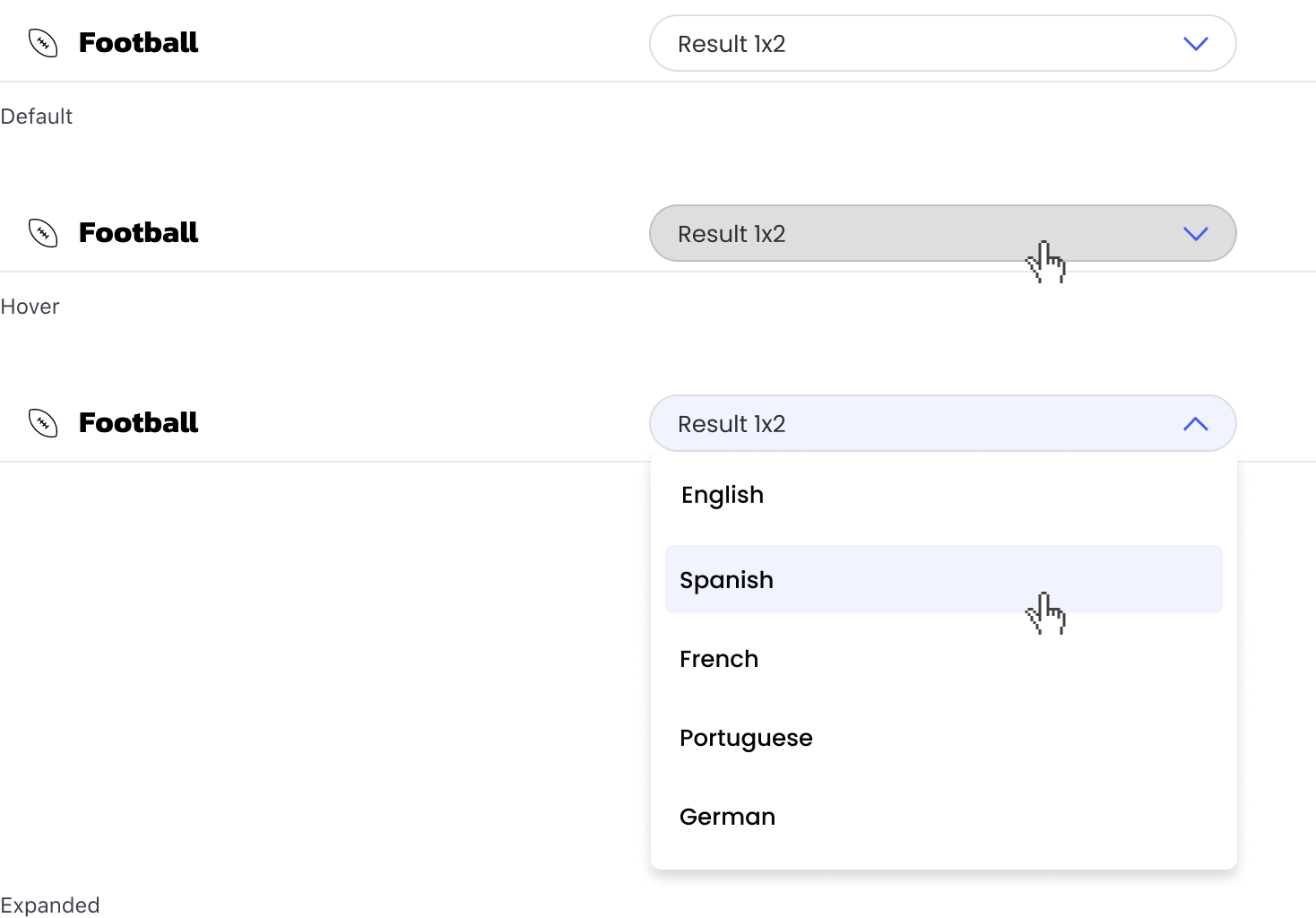
Dropdowns
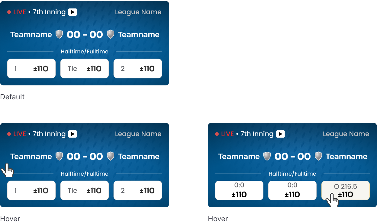
Scores
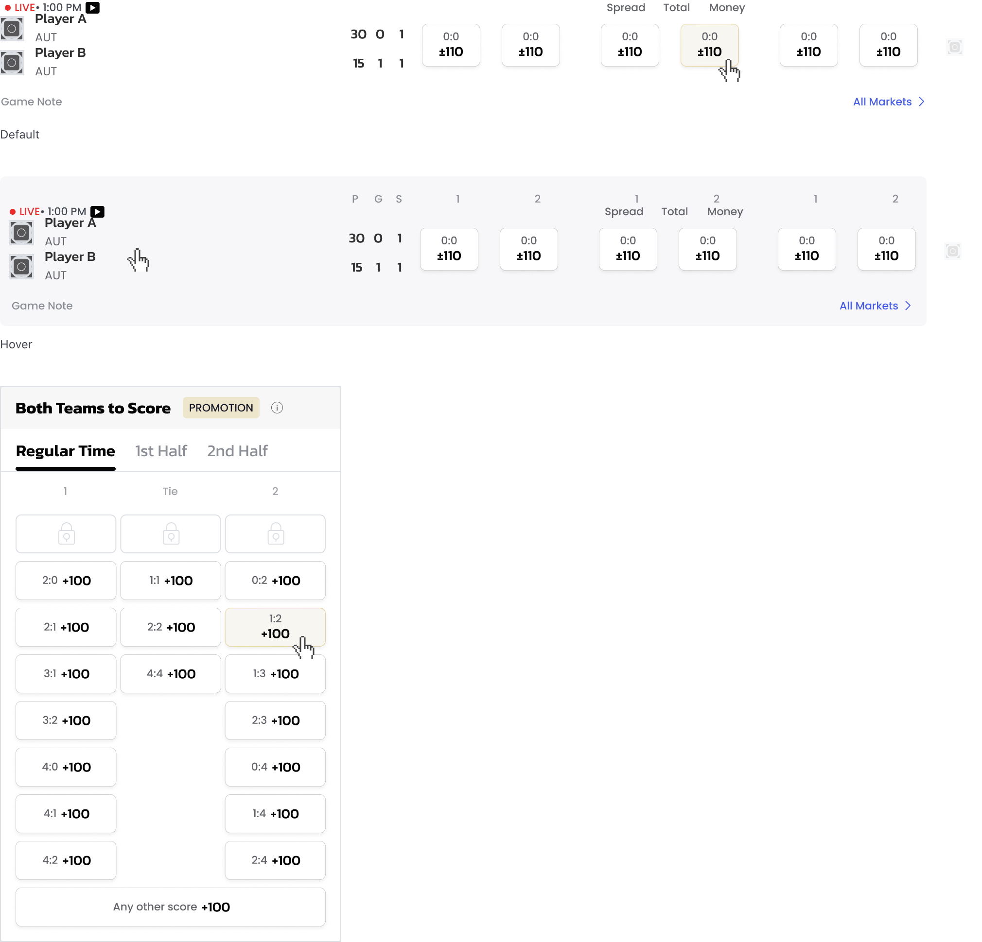
Score Cells
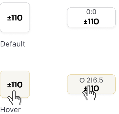
Buttons